Embrace simplicity
There are literally millions of logos out there in the world, and believe me, it’s no easy task to create one that is both simple and distinctive, but if done right it should set you apart, be recognisable, and distinctively yours. Focus too much on creating something different, you can end up needlessly adding unnecessary elements or effects, and the end result is that you’re left with a logo that is way too complicated and trying too hard.
It’s not always about what you add; sometimes it’s more important what you take away.
The real purpose of any logo is to be recognisable, timeless, and versatile. If you look at some of the most well-known and respected logos out there… Apple, Amazon, Audi, Nike & FedEx. What is it that they all have in common? They’re simple right? These logos are the faces of some of the most powerful brands on the planet and by keeping their logos simple, it gives them clarity, confidence and a sense of who they are.

Are you really getting your money’s worth?
At first, it might seem like simple logos are too easy to create, but it is actually much more challenging to create something simple and succinct.
Often during the design process businesses get carried away, trying to make their logo sum up everything they do in one wordmark or symbol. The job of the logo is to distinguish it from the competition and to make it easily identifiable, it’s the face of the company. Does your face define everything you stand for as a person? A well-designed logo should give your target audience an immediate and clear sense of you, but it doesn’t define the company… just like your face, it merely makes you recognisable.
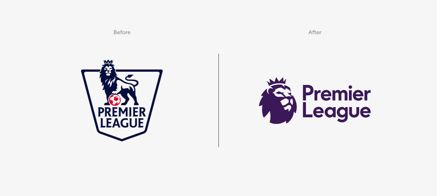
Below is a great example of how design agency ‘Design Studio’ simplified the Premier League logo to enable it to work across every imaginable touchpoint.

Done well, a clean, uncluttered and clever logo can say a lot with very little!
We now live in a world where time is at a premium and the need for a clear identity to catch peoples attention is a necessity for any business, and the most effective logos are ones with a simple idea at their core. To create a strong brand mark, simplicity is vital. Here are a just a few reasons why:
Simple is memorable.
Simple logos stick in your mind making them easier to remember. Busy, complicated logos are more challenging to remember and therefore harder to recognise when you see it again.
Simple is versatile.
By keeping your logo simple, it allows it to be more versatile and adaptable. Across different applications, both online and in print your logo may need to be viewed smaller than a stamp, or as tall as a billboard while still maintaining consistency & integrity.
Simple stands the test of time.
Trying to incorporate too many factors of a companies identity into a logo not only clutters the message but as the business evolves, there’s a good chance the logo will become irrelevant. By keeping it simple, the logo has a much greater chance of staying relevant long into the future.
Simple resonates.
Your logo doesn’t have to be a literal representation of your product or service, but it must connect with the values & qualities of your business, the consideration of shape, style, colour and choice of fonts all play a significant part in striking a chord with your intended audience. A simple well-designed logo stands much more chance of creating a positive reaction.
In an age when your logo needs to appear on so many different applications, it needs to be designed to accommodate this and make sure it works just as well on a banner, business our on your Instagram account. Does it also need to be scaled up to be used on signage? Is it possible to have it embroidered on the new work shirts?
So, my advice to you is when designing your next logo… keep it simple!
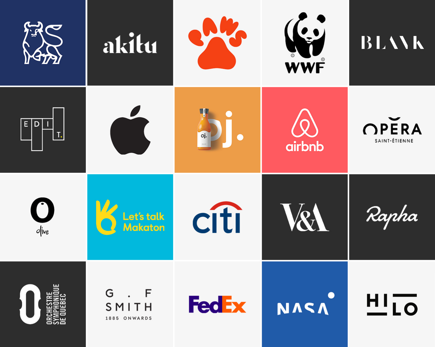
To finish, here are just a few of our favourite logos… can you guess what they all have in common?
