The Challenge
The Result
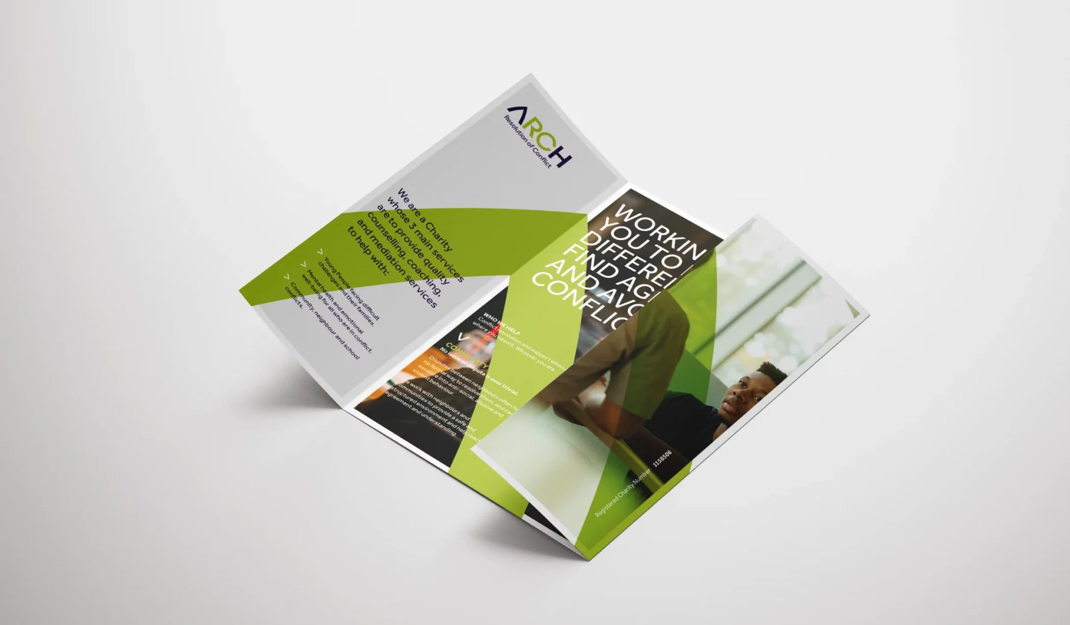
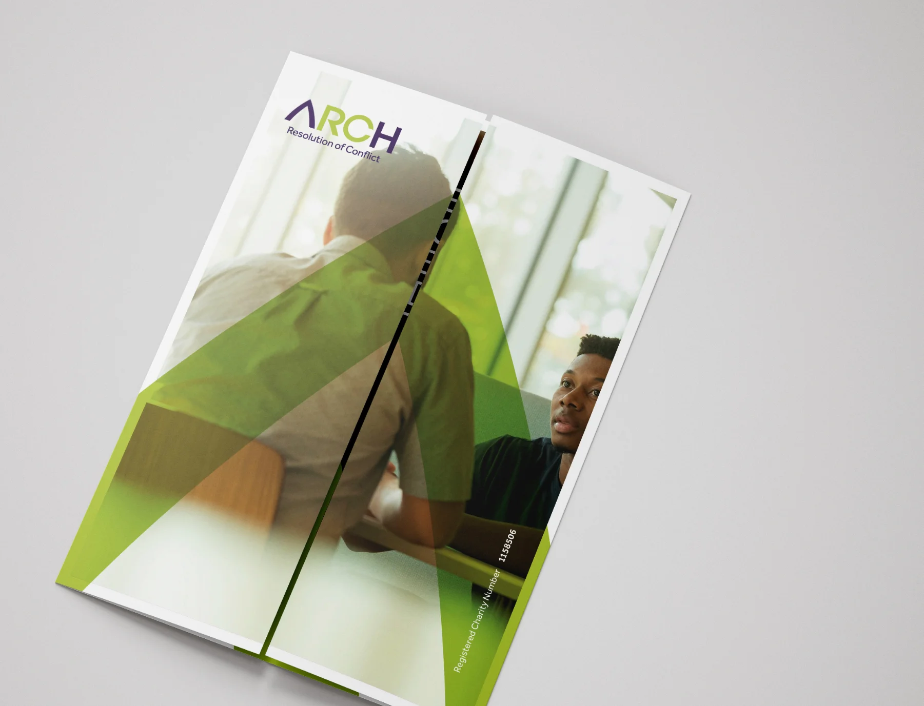
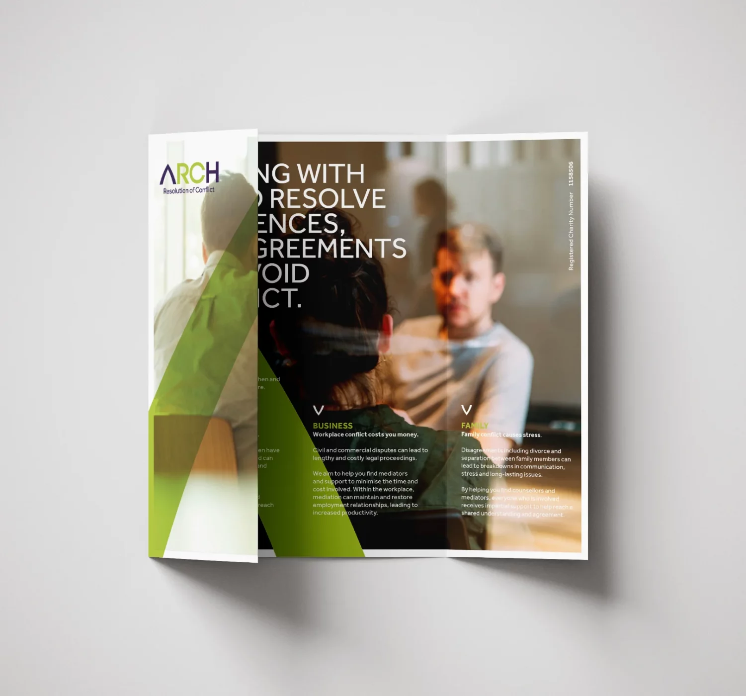
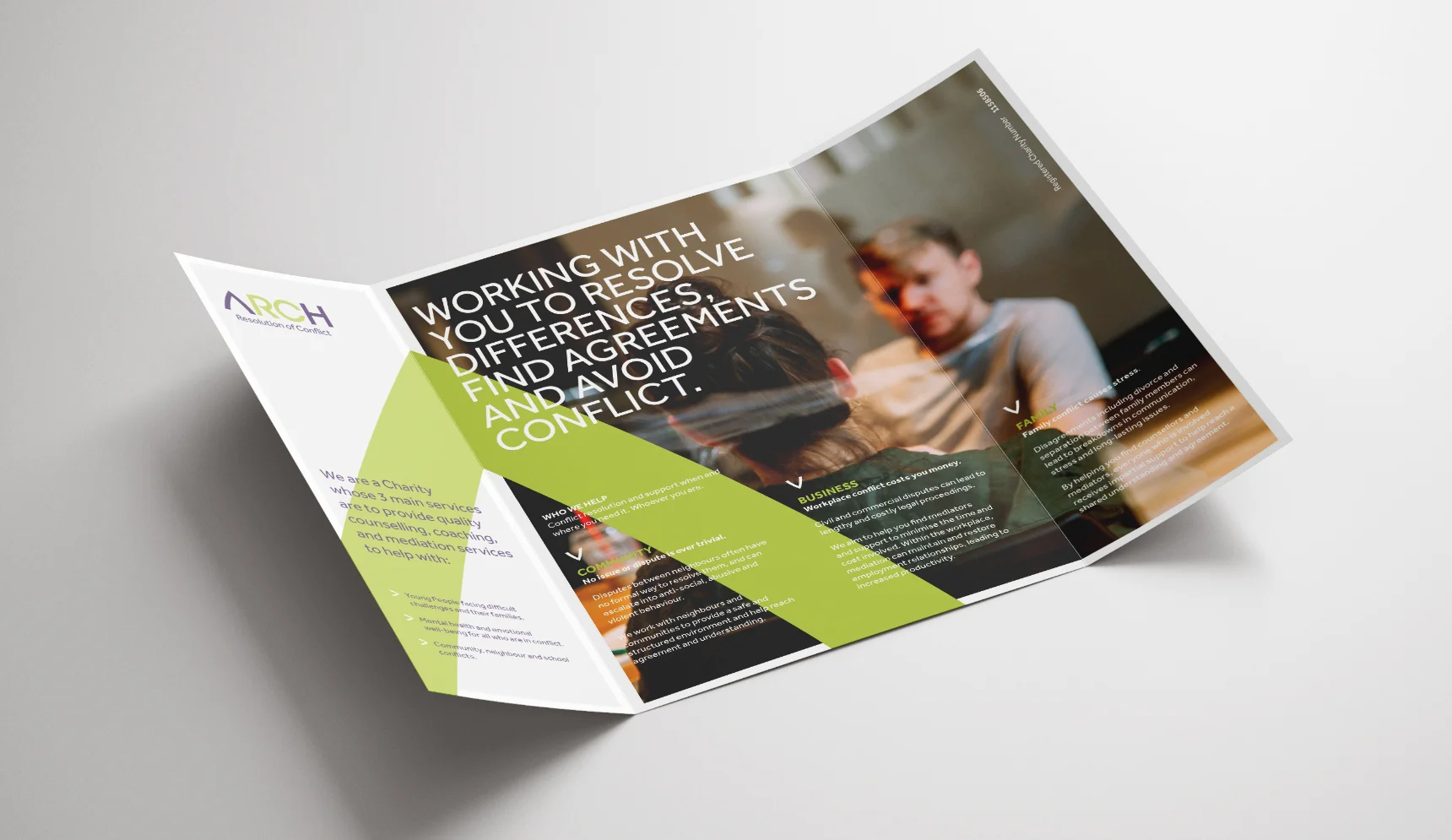
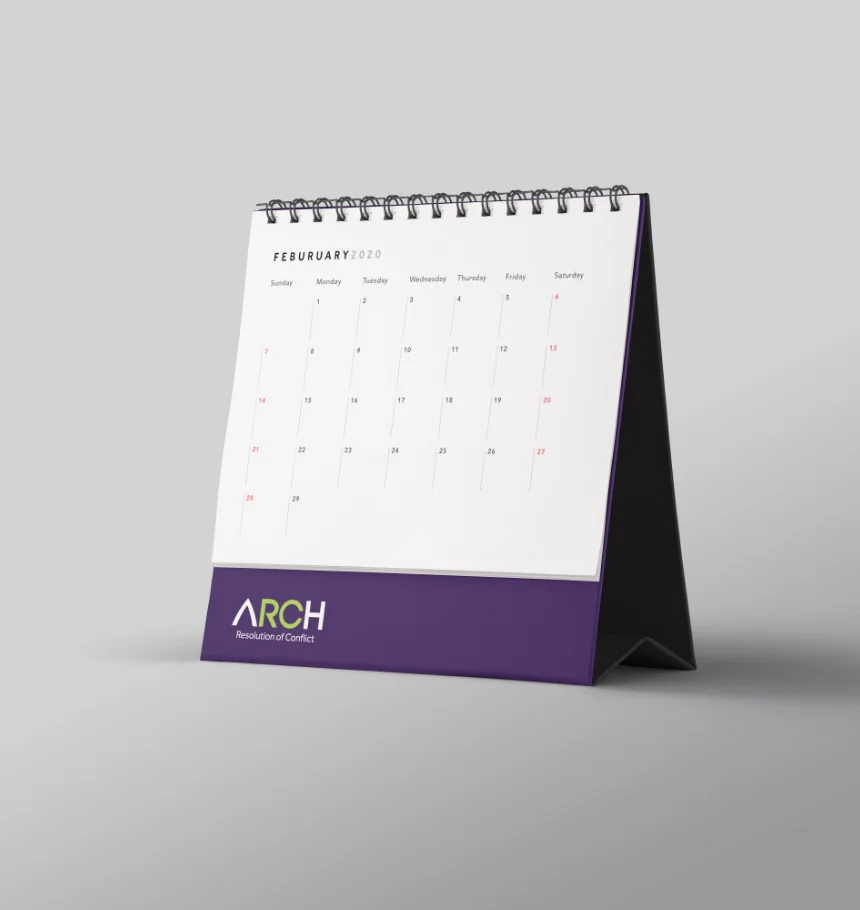
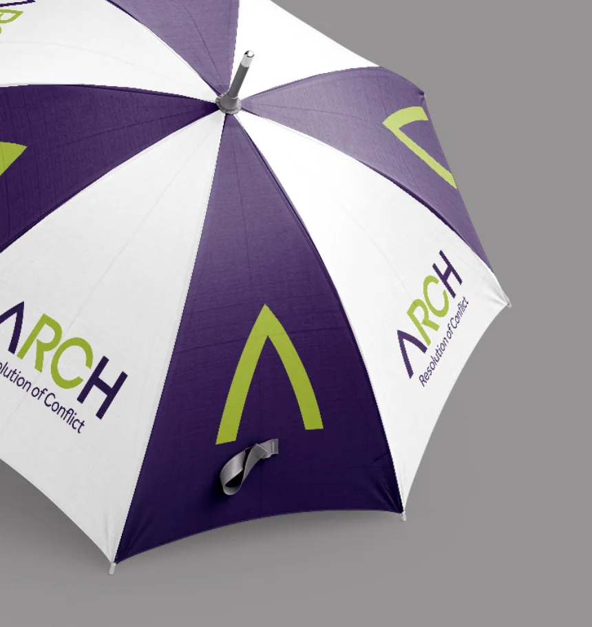
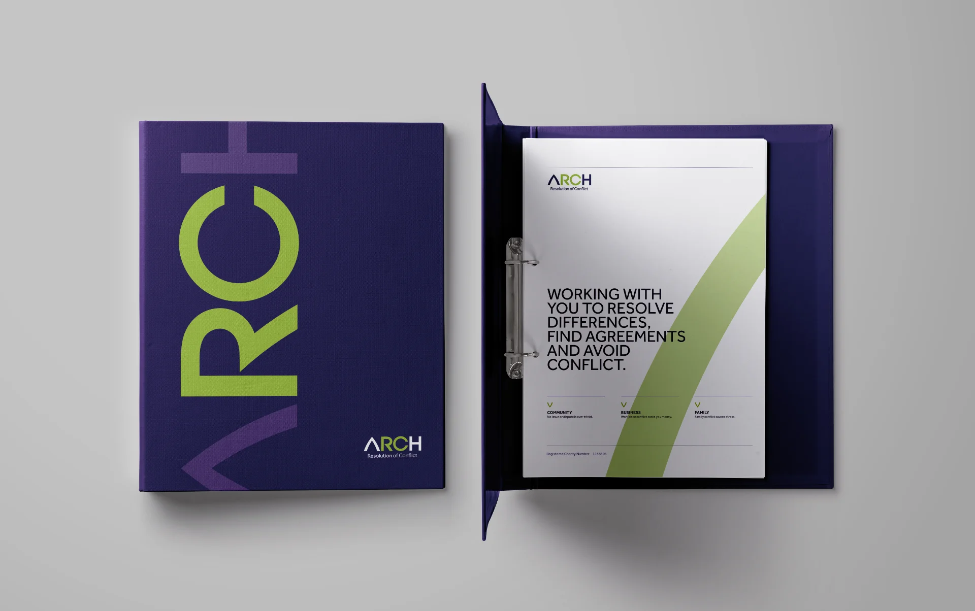
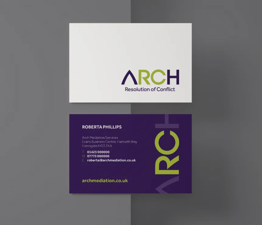
I designed a modern, clean, and professional brand identity for ARCH, starting with a custom hand-drawn logo. The iconic letter ‘A’ embodies strength, stability, and the capacity to bear significant weight. Its arch shape symbolizes openness and serves as a gateway to new beginnings—an ideal representation for a company dedicated to resolving conflicts and fostering understanding.
The distinctive ‘A’ has become the company’s responsive brand mark. A fresh purple and green color palette was introduced to make the brand feel more approachable and memorable, striking a balance between professionalism and warmth.

“Having worked with Richard at Rebus on several occasions, he always comes up with creative solutions to any brief. He is a pleasure to deal with and never fail to impress”.hug
Caroline Barr, Marketing Consultant Arch Mediation