Embracing Future Potential’s aim is to provide access to employment, work-based learning, and career support for all. Through their specialist jobs boards and wealth of resources, they focus on supporting those early in their career and those who face barriers to employment opportunities, such as disabled people, those returning to work, women, refugees and many others.
The Challenge

The Approach
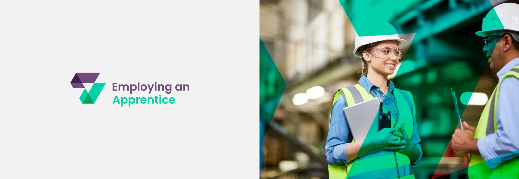
As the brand family was expected to expand over time with unique names, I chose to focus on creating an emblem or icon to unify all the brands. After several iterations, the final design was met with approval from everyone involved. The result is a simple yet distinctive mark that works seamlessly across various applications, from badges and banners to merchandise and social media.
The concept behind the logo revolves around two ticks, symbolizing the company’s mission in two key ways: 1. Helping job seekers find meaningful careers and connect with the right employers, and 2. Assisting employers in discovering candidates who may have otherwise been overlooked. The arrows formed in the negative space represent the connection between employers and employees coming together.


The Result
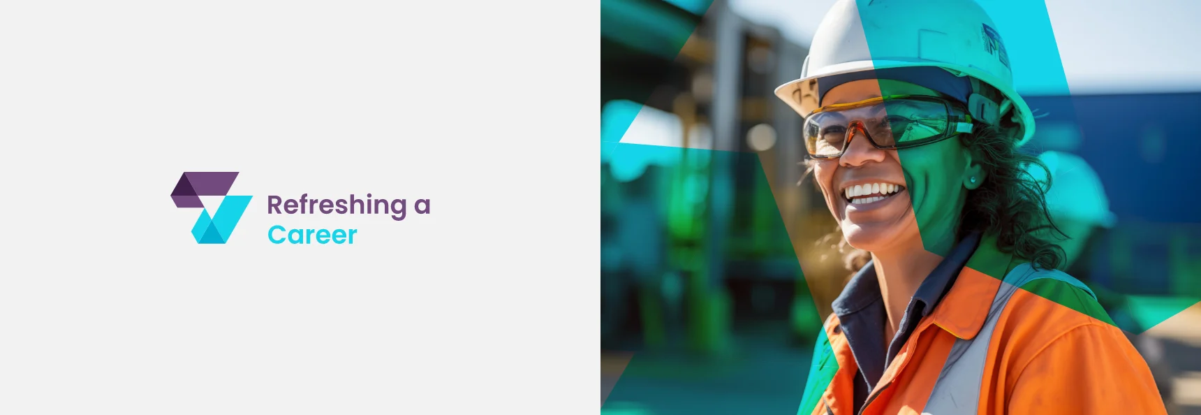
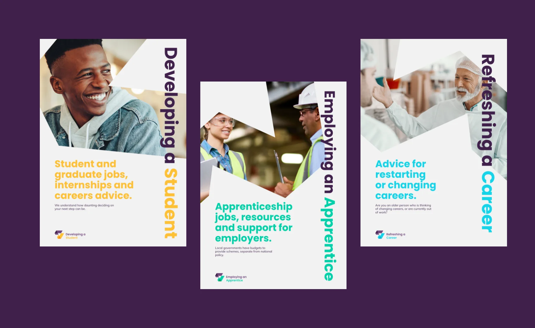
By strategically using color, typography, and a consistent brand identity, I was able to distinguish the different networks within the business, while ensuring they each had a unique look that made them instantly recognizable as part of the same family.
“Richard was great to work with and was extremely patient! We couldn’t be happier with the end result”.
Luke Kitchen, Managing Director Embracing Future Potential