HN06 Limited collaborates closely with its clients to design and deliver practical, tailored governance solutions that drive efficiency and support organisational success.
The Challenge
Helen and Nathan, a husband-and-wife duo, reached out to me to develop a new logo and brand identity for their business, HN06, which specialises in pragmatic governance solutions. They wanted to avoid the image of a large corporate entity and instead create a more personal, approachable experience, reflecting the fact that they intended to keep the business small and centred around their individual expertise. To give the brand a personal touch, they decided to name the business HN06, using their initials and the year they were married, and sought a logo design that would capture this meaningful connection.

The Logo
The logo is a thoughtful representation of the bond between the two directors, Helen and Nathan, a married couple whose shared vision is at the heart of their business. The intertwining of the letters “N” and “H” is not only a visual representation of their names but also symbolises the seamless partnership they share, both personally and professionally. The inclusion of “06” reflects the significant milestone of their marriage in 2006, a foundation that strengthens their commitment to each other and to their work. The use of interconnected lines throughout the logo further emphasises continuity, togetherness, and collaboration, highlighting the strong, ongoing relationship that drives their shared vision.


The Result
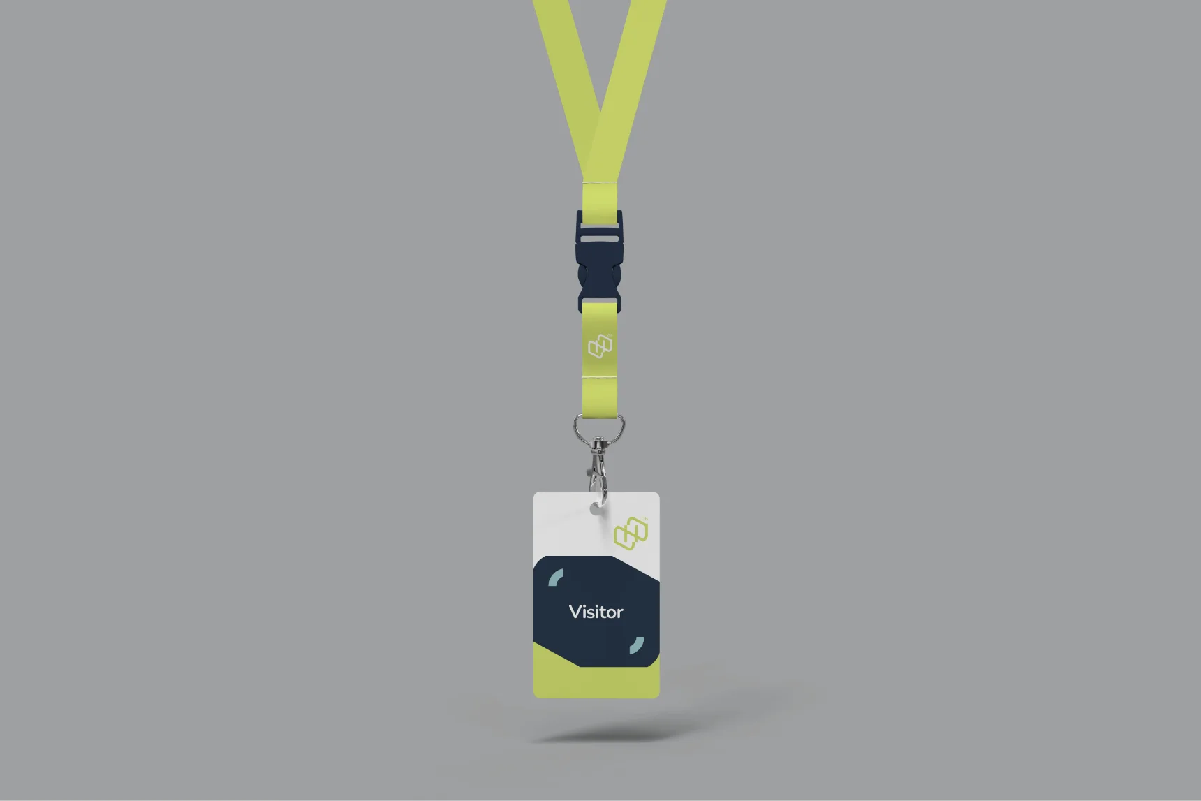
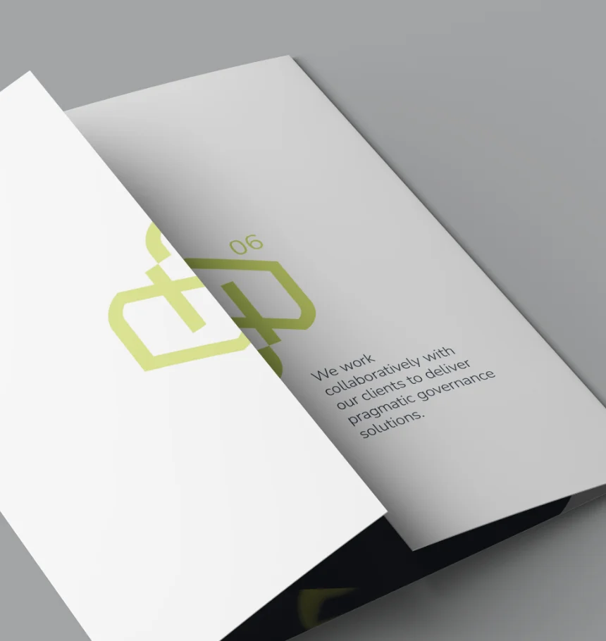
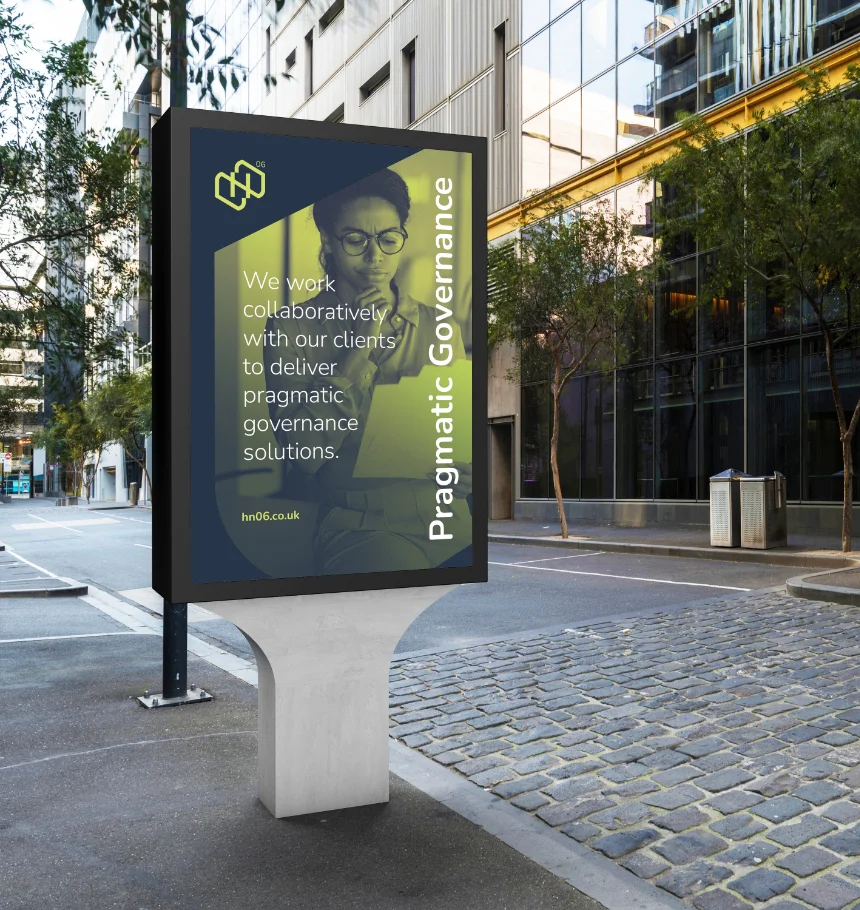
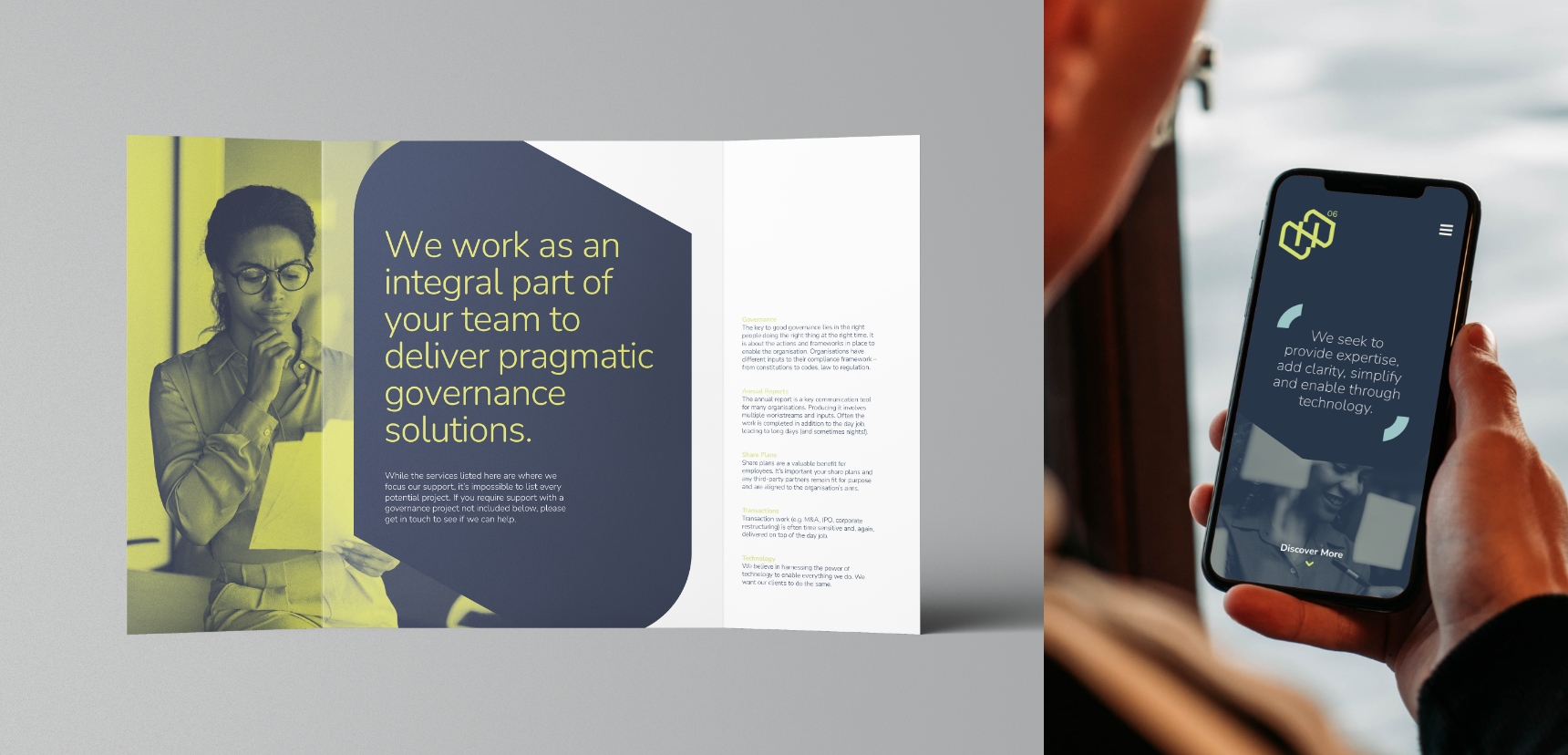
The result is a sleek, modern identity that offers flexibility, utilizing the individual shapes derived from the new logo to adapt seamlessly across various applications. The overall aesthetic remains rooted in their corporate environment, yet the distinctive color palette and innovative use of imagery set them apart from competitors, creating a unique and recognizable brand.
“As we set up our new consultancy business, we knew having a strong, recognisable brand was essential. Richard worked with us to establish what identity and values our brand needed to convey. Following this, he presented us with options regarding typeface, colour palette and messaging, from which we chose the elements we liked. Richard then developed a suite of assets, including logos, social media banners, PowerPoint and letterhead templates, business cards and icons.
We were thrilled with the brand identity he developed and found him very easy to work with. We would definitely work with him again”.
Helen & Nathan Baker, Directors HN06