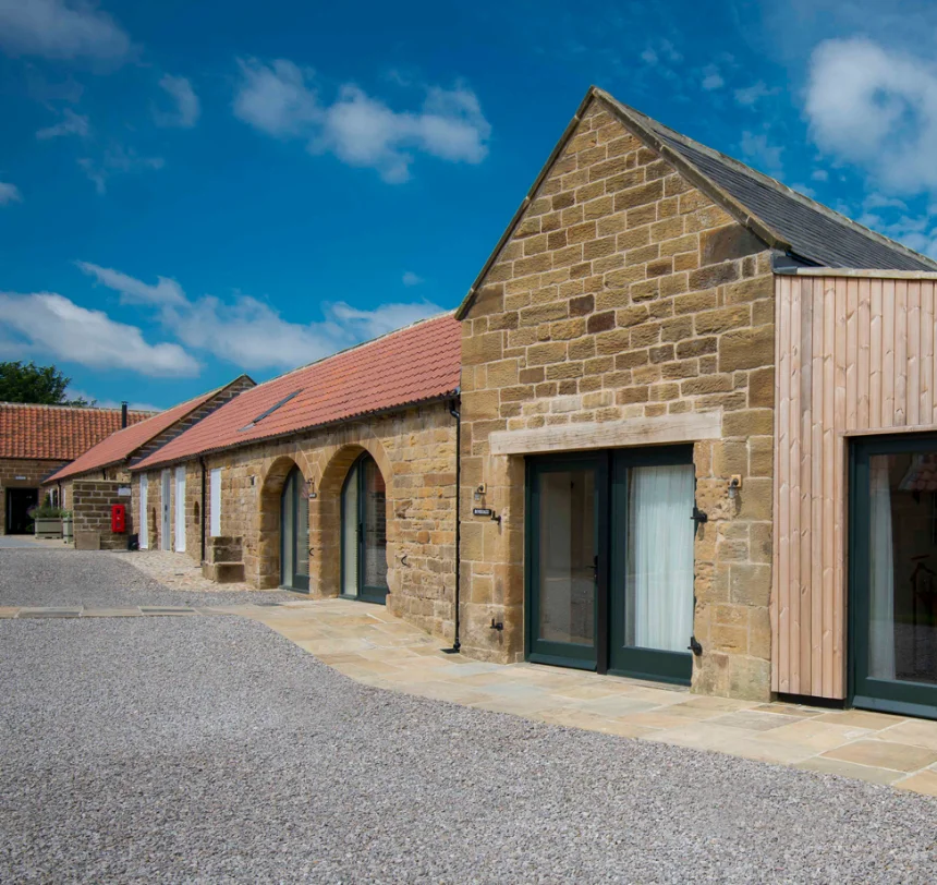
For over 90 years, Moody Construction has been built on strong family values, earning its reputation as one of Yorkshire’s leading building contractors
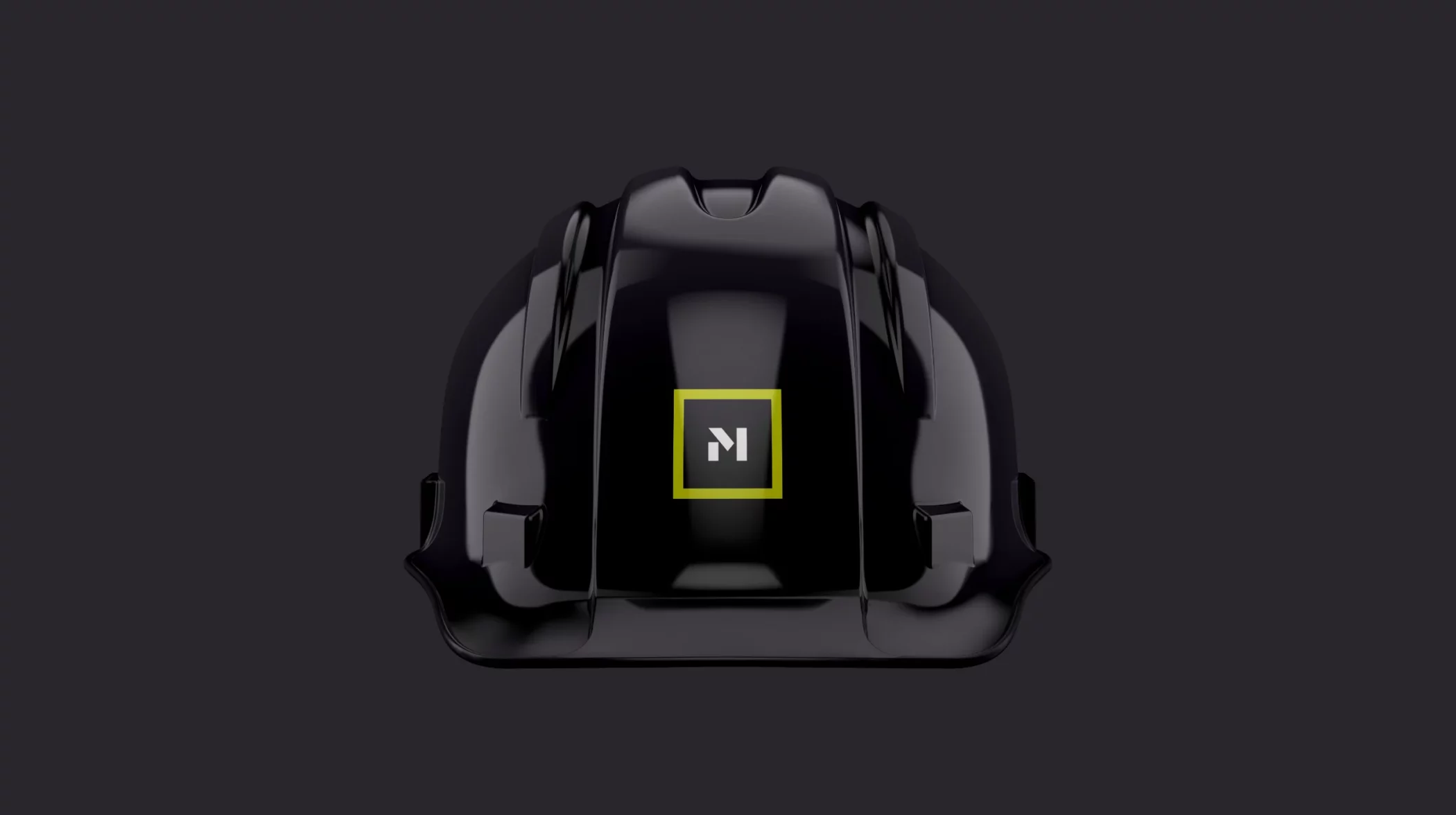
The Challenge
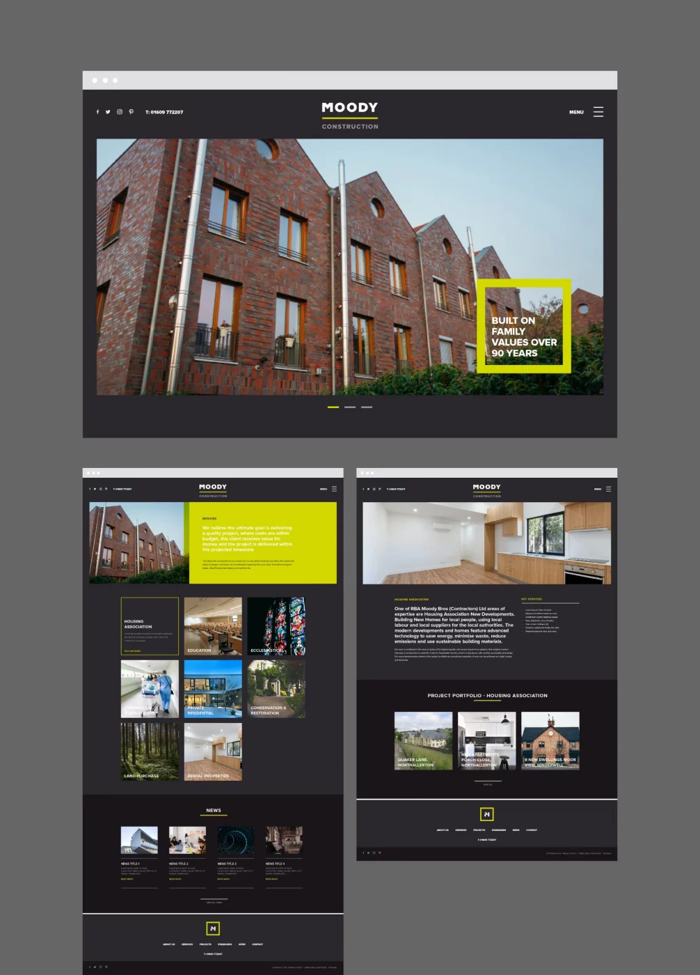
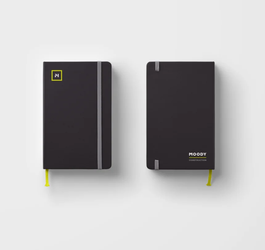
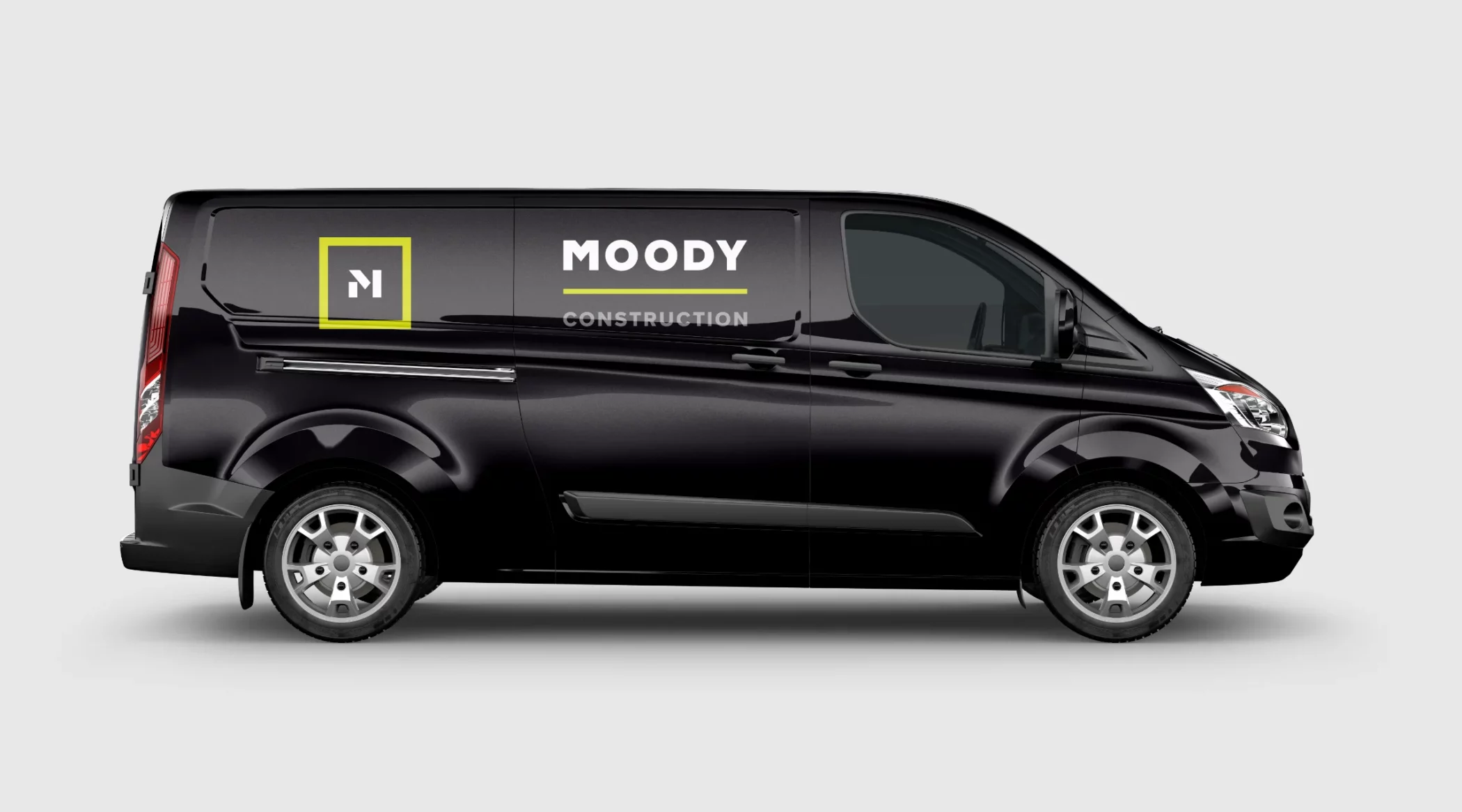
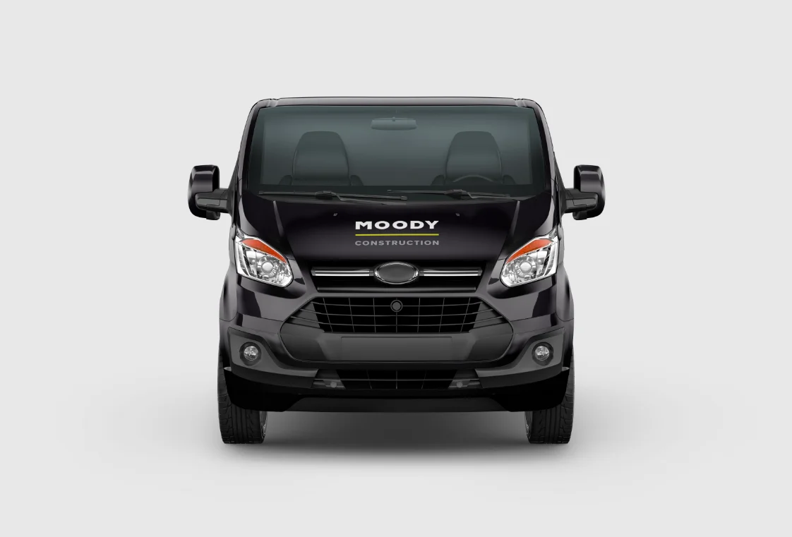
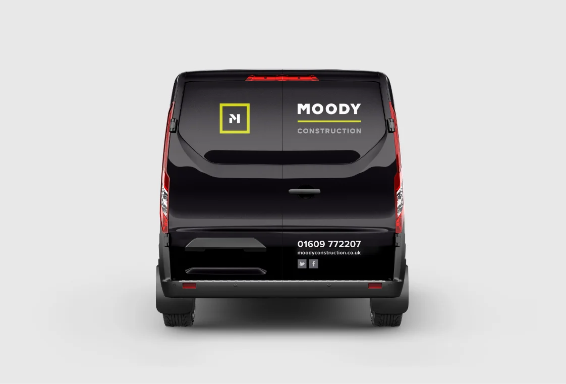
For over 90 years, Moody Bros has been a proud family-run business. However, their identity no longer captured who they are or how the company has evolved. Renowned today for their modern and innovative approach to projects, they needed a fresh identity that truly reflected their ethos. My challenge was to craft a cohesive brand identity that resonated across all applications, including their digital presence, vehicle livery, workwear, and company literature.
The Approach
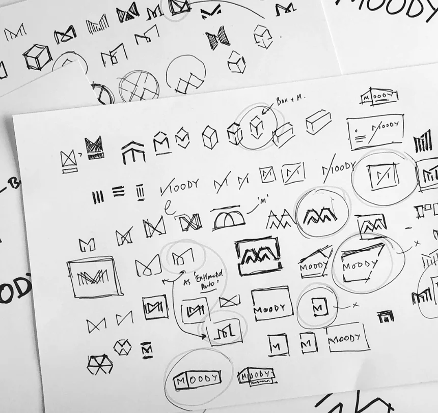
The primary aim of the rebrand was to develop a clean, distinctive, and memorable logo and identity. Drawing inspiration from the way shapes are formed and interconnected to create structures, I sought to design a logo that embodies these principles in an innovative and authentic way.
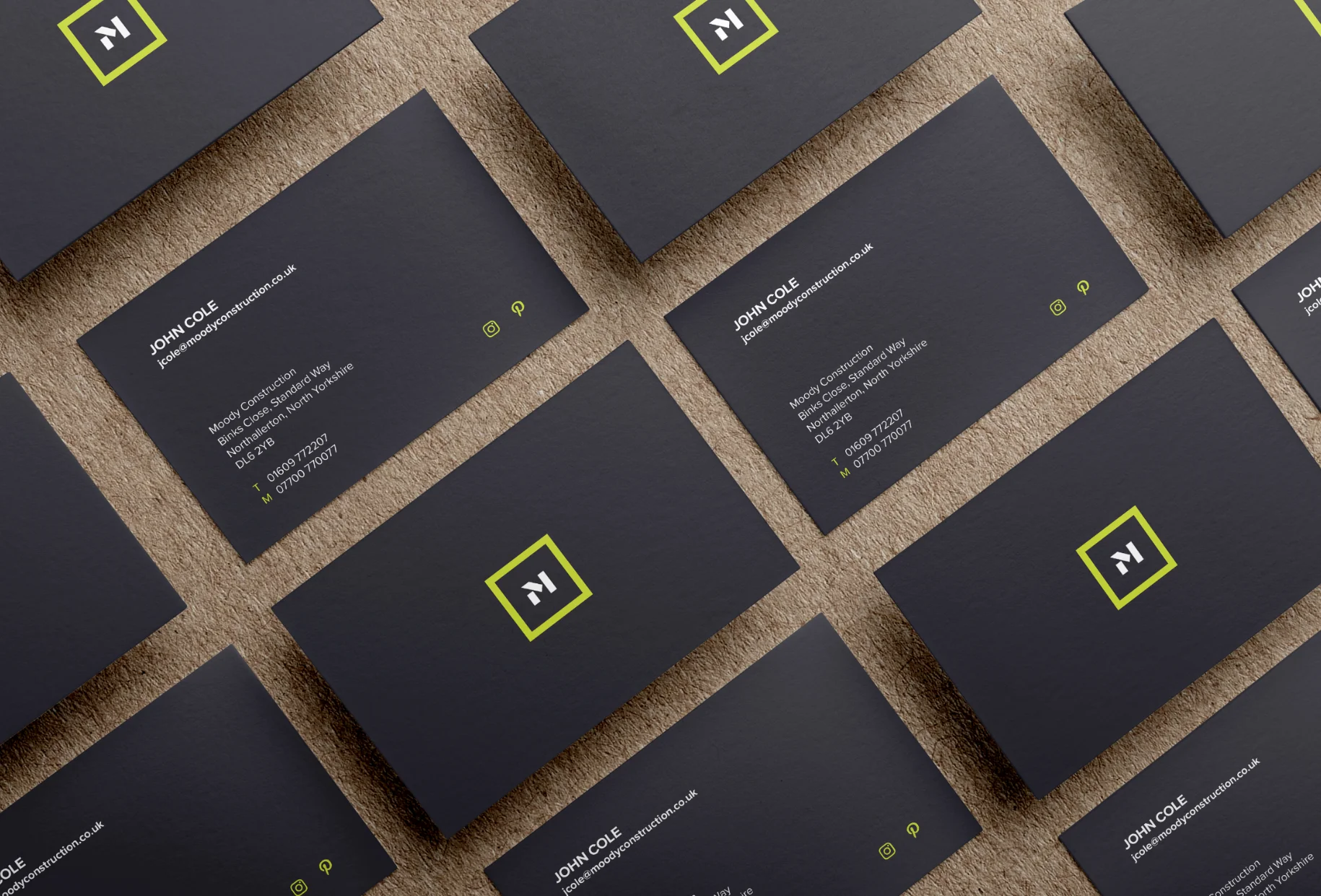
The Result
“We appointed Richard to help us with our company, rebrand. He produced several options for us to consider, and once the preferred option had been chosen, he worked with focus, drive, attention to detail and used his creative magic to bring the design to life”.
James Moody, Construction Director Moody Construction