A bike shop driven by a true passion for timeless customer service and all things cycling, dedicated to creating memorable experiences for every rider, from casual enthusiasts to seasoned pros!
The Challenge
This project was an exciting opportunity from the start. When I first met James and Gemma, the founders of RedSky Bikes, they were enthusiastic and eager to give me full creative freedom in shaping their new brand. Their main goal was to develop a modern and dynamic identity that truly captured their vision.
The Approach
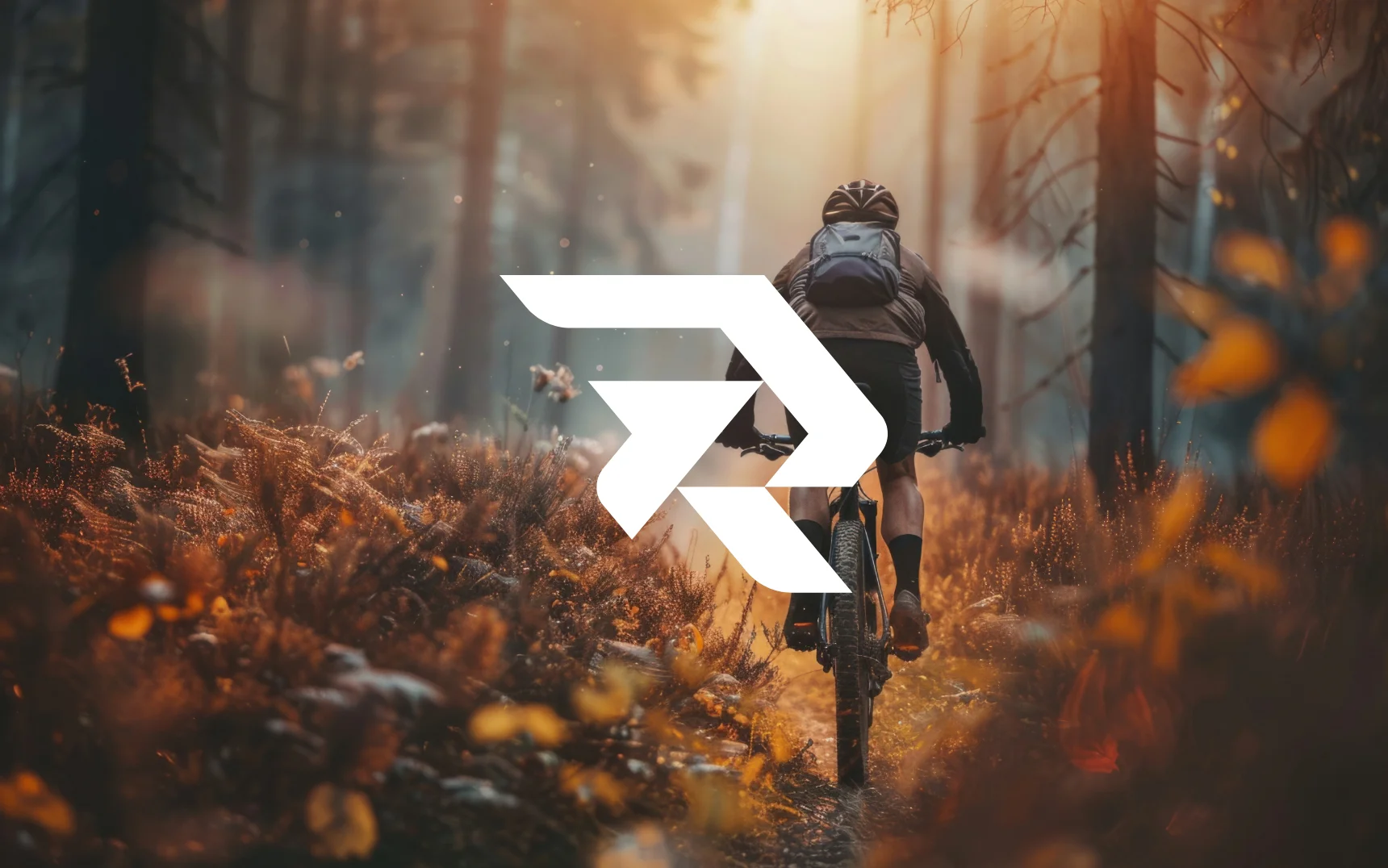
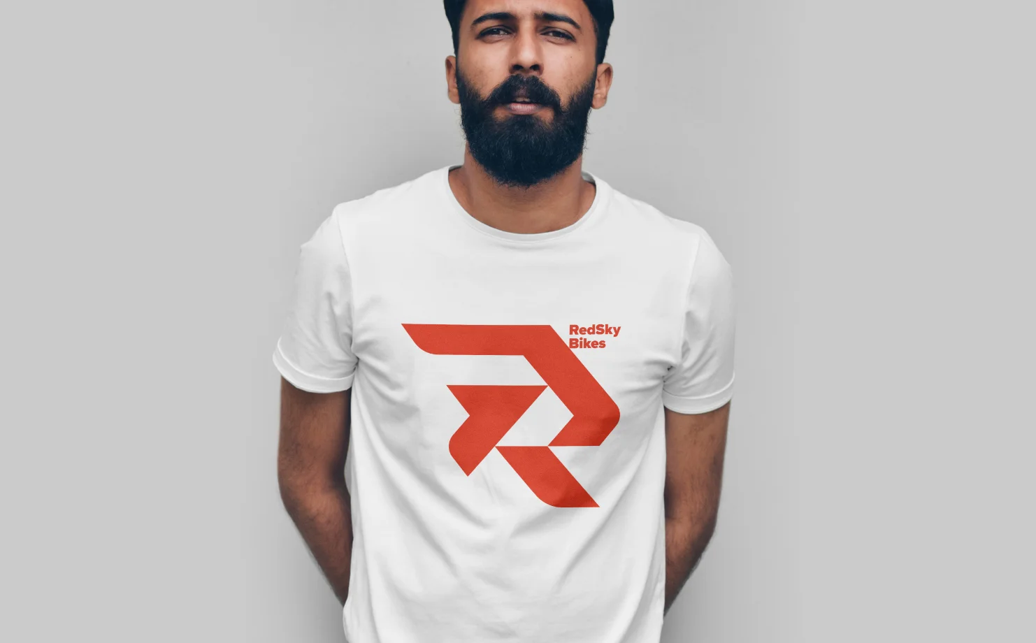
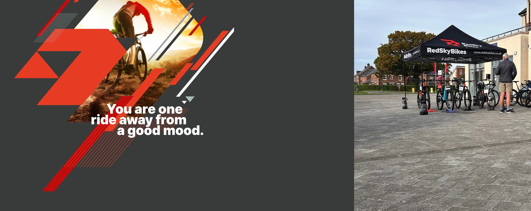
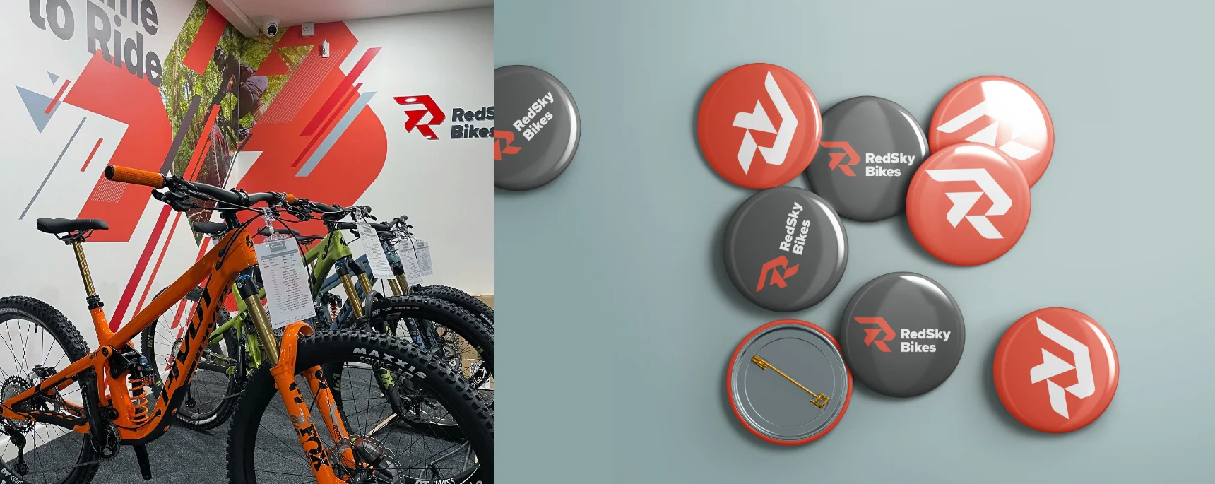
The clients wanted a vibrant, dynamic vibe for their new brand identity. My goal was to develop a variety of elements that I could mix and match to create custom graphics. As a huge fan of using a grid system to craft logos and identities, I applied this method to the RedSky logo, constructing it with a triangular grid. This approach allowed me to design the new ‘R’ icon and then expand the grid system to generate numerous complementary shapes that enhanced the overall logo design.
The Result
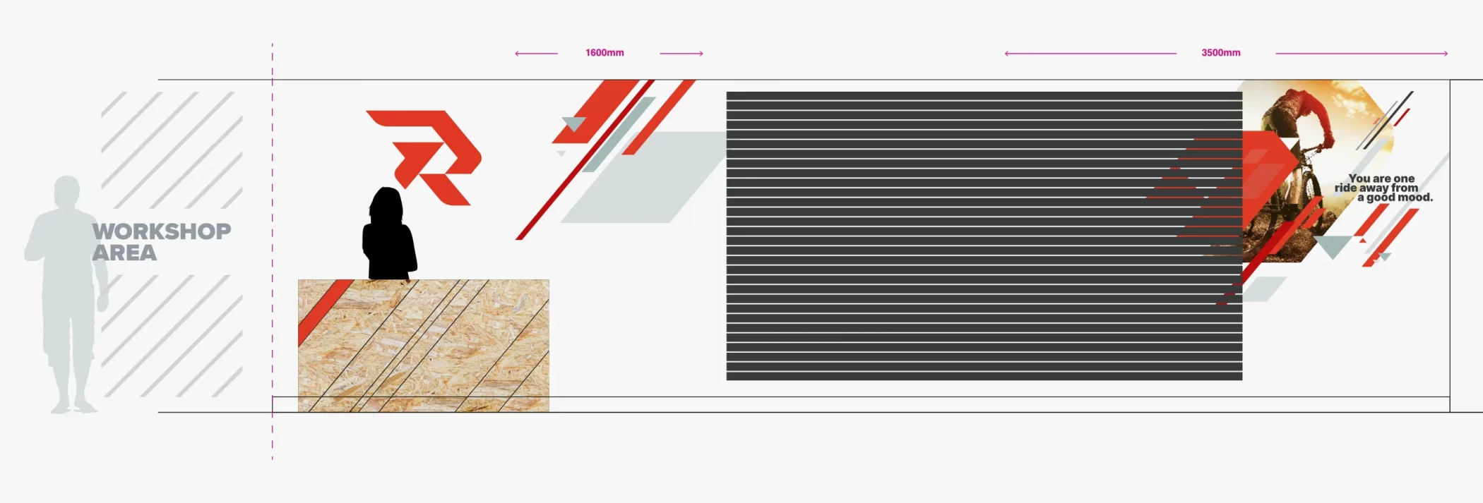
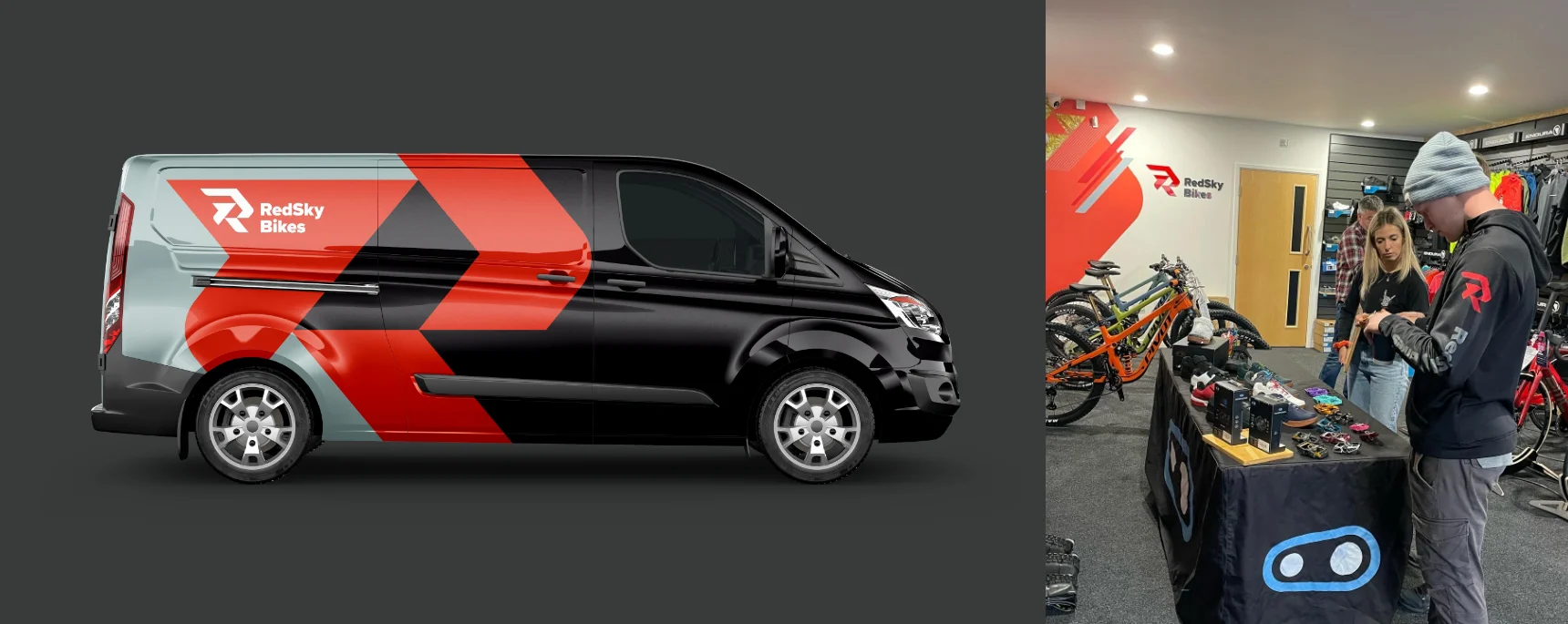
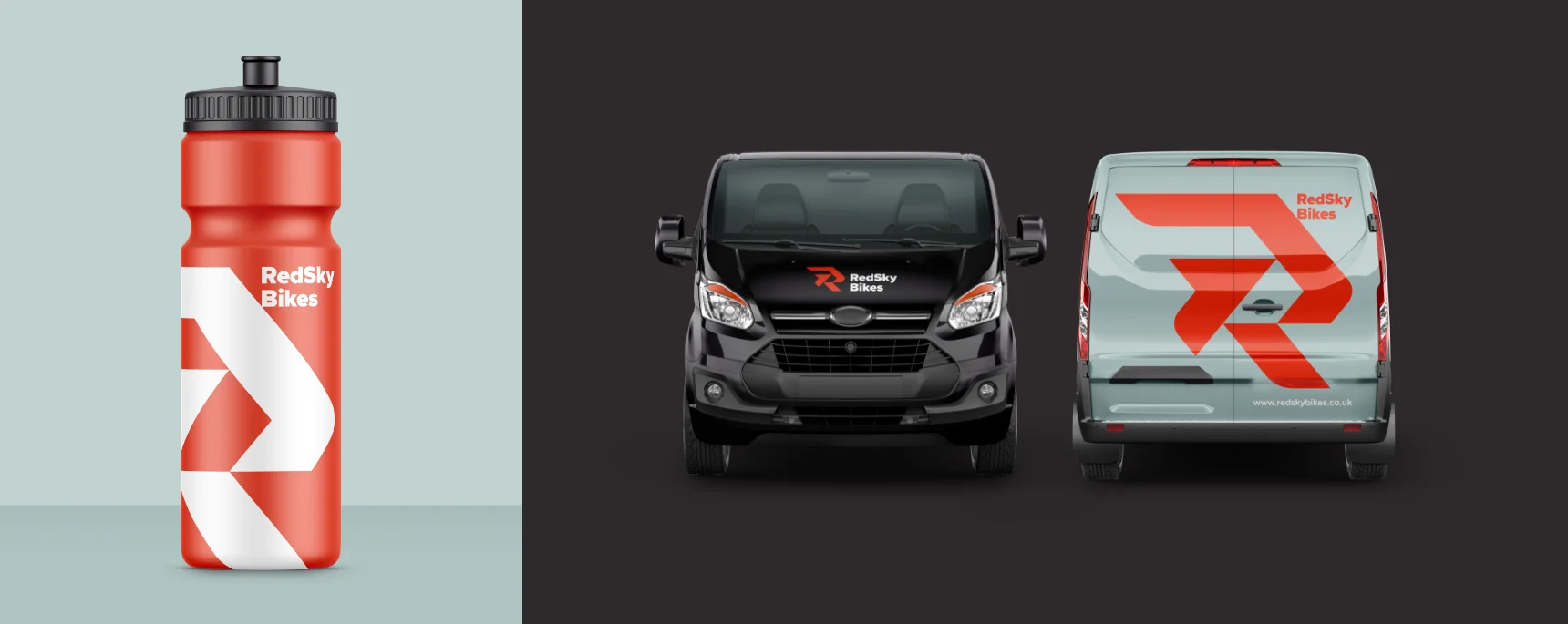
The final outcome was a tremendous success, receiving great feedback from RedSky Bikes’ customers. As Gemma and James put it, “We now have an identity that truly reflects who we are as a business.” The new design not only gives them greater flexibility in how they present themselves across various platforms and materials, but it also ensures they maintain a unique and memorable look. This new identity has strengthened their brand presence, fostering stronger connections with their audience and setting them apart in a competitive market.
Richard was so easy to work with, so patient & calm throughout the whole project even when part way through we had a company name change! He is incredibly talented in how he brings your brand to life.
Gemma & James, Business Owners RedSky Bikes