The Avalon Group is a renowned charity dedicated to supporting individuals in leading independent and fulfilling lives. Through a range of services and initiatives, they help people live with dignity and confidence.
The Challenge
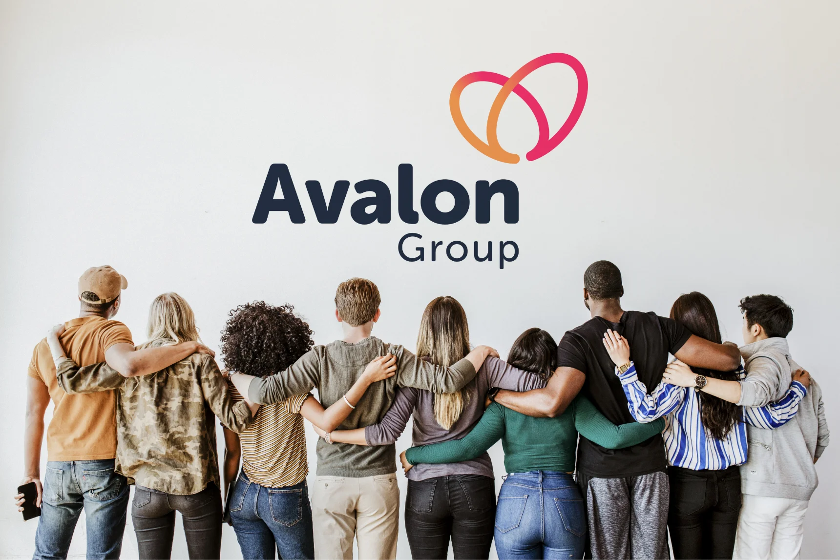
When the marketing team from the Avalon Group reached out to me, they were already familiar with my work and believed we would be a great match for collaboration. Their current identity and logo didn’t reflect who they truly were. The colors were too harsh and sterile, the typography too angular and unwelcoming, and without any established guidelines, maintaining consistency across all nine of their registered offices was a challenge.
The Approach

The Result
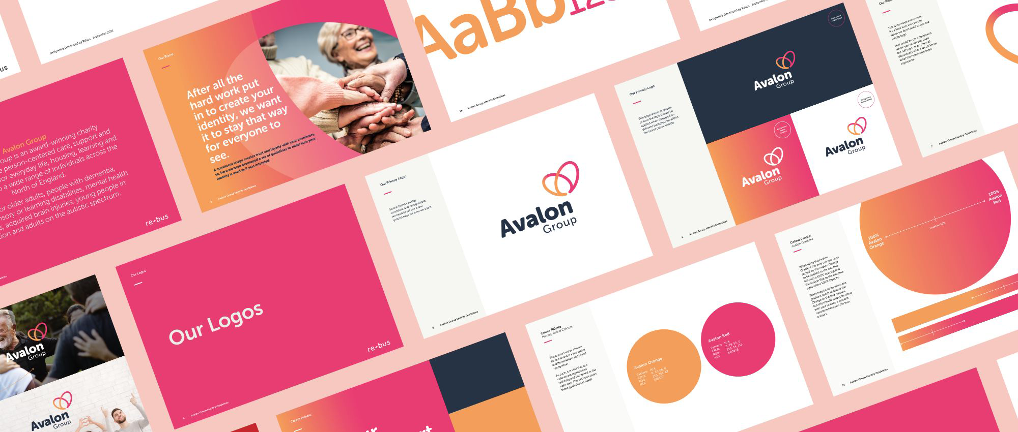
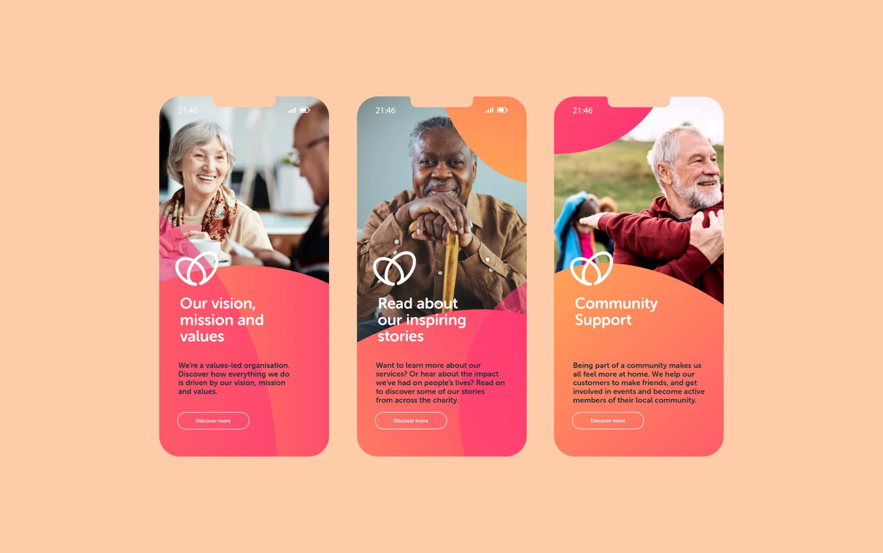
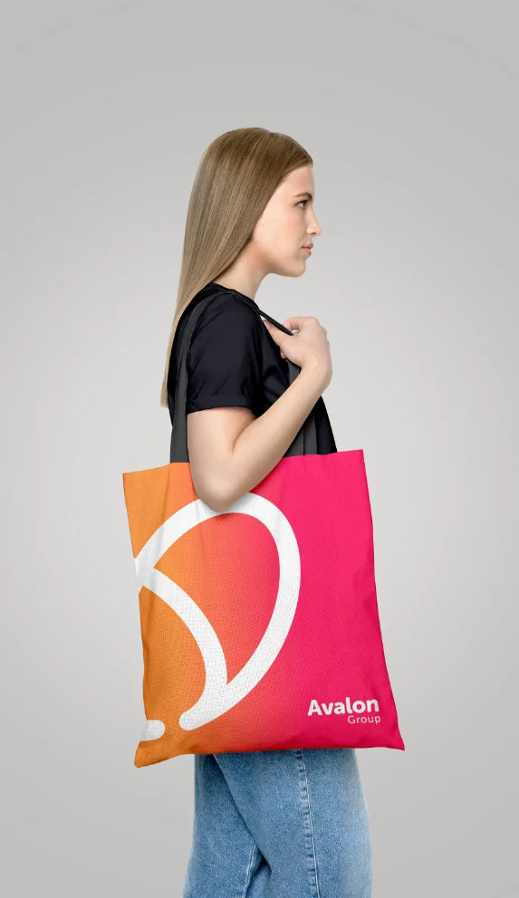
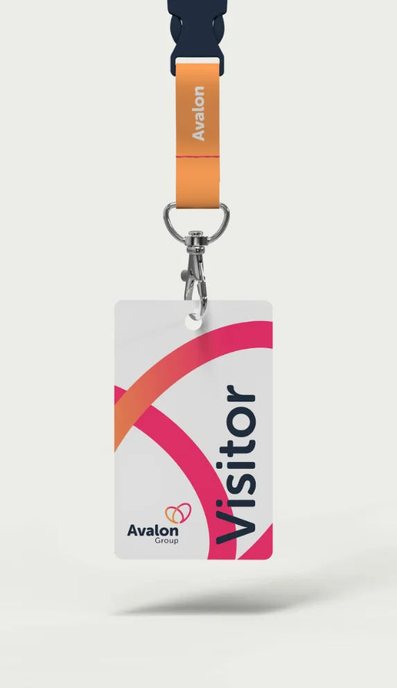
The final outcome was a resounding success, receiving excellent feedback from Avalon Group customers. They now have a more modern, approachable, and accessible identity that truly reflects who they are. Furthermore, with the creation of comprehensive identity guidelines, all employees will present a consistent look and message moving forward.
We worked with Richard at rebus to accurately depict who Avalon is and where we wanted to be in the future. Richard pulled together input and feedback from various stakeholders and presented us with options that each captured core elements of our vision, mission and values. Our customers made the final decision, and we are so happy with the brand. It goes beyond just the logo itself, with Richard providing us with an accessible brand usage document to support the rollout of the brand across our 9 registered offices.
Richard was great to work with; communication was excellent, and we always felt we had complete control over where the branding was going.
James Plummer, Head of Business Development and Communications Avalon Group